
The code for this article is available on my GitHub:
JeffreyBane/ALF-My-Children-Loading-Dialog-App (github.com)
When it comes to components, Angular is one giant dysfunctional family. Parent components constantly trying to control its child component behaviors, child components resenting its parent components and giving them the finger and staying out to all hours, failing out of school and living at home until they are 30.
Wait, that’s not Angular, that’s my family.
ANYWAY, we certainly have to deal with parent components managing child components in Angular. Child components typically load their own data and when you have many child components making their own API calls, populating forms, etc., it would be nice to have a way for the parent to coordinate all that.
A simple use case, but one I find out coming up quite a lot is, I want to display a loading dialog on my parent component, something like “Please wait” or “Loading data” (with some animated something or other) until ALL my child components have loaded their data. In this article I’ll outline a fairly straightforward method I use to do just that and all it uses is output variables and some simple math.
For the “Loading” dialog, I’ll use an Angular overlay. An Angular overlay creates a floating panel and also darkens the rest of the screen to visually indicate to the user, “Just wait a minute Skippy, don’t do anything yet” which I like.
Let’s start by creating a “Loading Data” component to serve as our overlay. We’ll also be using Angular Material in this project (I use it in most projects) as it creates some nice modern looking web components.
Let’s install that first into our project:
>> ng add @angular/materialYou’ll be prompted for a few things, just pick a nice color scheme and respond (y)es to any questions. Then we’ll need to modify our app.module.ts to import some items from Angular Material. We’ll need two imports in this case, the mat-card and the progress bar:
import {MatCardModule} from '@angular/material/card';
import {MatProgressBarModule} from '@angular/material/progress-bar';
Then we need to include them in the imports section:
  imports: [
    BrowserModule,
    AppRoutingModule,
    BrowserAnimationsModule,
    MatCardModule,
    MatProgressBarModule
  ],
This is the part of Angular Material that can be a bit of a pain, locating where to import the thing you want to use from. Easiest way is to go to this link: https://material.angular.io/components/categories. Then find the thing you’re wanting to use and click on the API tab:

In this case we selected “Button” on the left. The API tab then tells us what import we need to use.
One other item we’ll need to install is the Angular CDK, which stands for component development kit. This library contains several objects that we’ll need for this example. Let’s also install that:
>> npm install @angular/cdkAnd again we’ll need to modify our app.module.ts file to import the module and include it in our imports arrray (new code only displayed):
import { OverlayModule } from '@angular/cdk/overlay';
.........
.........
  imports: [
........
    OverlayModule
  ],
Our completed module now looks like this:
App Module (app.module.ts)
import { NgModule } from '@angular/core';
import { BrowserModule } from '@angular/platform-browser';

import { AppRoutingModule } from './app-routing.module';
import { AppComponent } from './app.component';
import { BrowserAnimationsModule } from '@angular/platform-browser/animations';

import { MatCardModule } from '@angular/material/card';
import { MatProgressBarModule } from '@angular/material/progress-bar';
import { LoadingDataComponent } from './loading-data/loading-data.component';
import { OverlayModule } from '@angular/cdk/overlay';

@NgModule({
  declarations: [
    AppComponent,
    LoadingDataComponent
  ],
  imports: [
    BrowserModule,
    AppRoutingModule,
    BrowserAnimationsModule,
    MatCardModule,
    MatProgressBarModule,
    OverlayModule
  ],
  providers: [],
  bootstrap: [AppComponent]
})
export class AppModule { }
NOTE – If at any time during this exercise you get initializer errors to the effect of LoadingOverlayRef not having an initializer, add this to your “compilerOptions” section in ts.config.json:
“strictPropertyInitialization”: false
I don’t much care for this check, so I turn it off, but I’ll leave a link that explains this setting further at the end of the article, also showing other options.
Now let’s create our Loading Data component that will be used as our overlay:
>> ng g c loading-dataThis component will be super simple, just some HTML.
Loading Data HTML (loading-data.component.html)
<mat-card>
    <mat-card-header>
        <mat-card-title class="headerText">
            Loading data...
        </mat-card-title>
    </mat-card-header>
    <mat-card-content>
        <mat-progress-bar mode="indeterminate"></mat-progress-bar>
    </mat-card-content>
</mat-card>
For the guts of this example, we’ll just use App Component though you’d likely be in a custom component in a real project. Let’s start with the very basics of coding an overlay that we can toggle on and off. First, the HTML we’ll use temporarily to test our overlay being displayed then hidden:
App Component HTML (app.component.html)
<button (click)="togglePanel()">Toggle Loading Panel</button>We’ll have more to do in the HTML file shortly, but for now this button will let us test our loading dialog. Now let’s wire up all the overlay goodness in our App Component:
App Component (app.component.ts)
import { Component, ViewContainerRef } from '@angular/core';
import { Overlay, OverlayConfig, OverlayRef } from '@angular/cdk/overlay';
import { ComponentPortal } from '@angular/cdk/portal';
import { LoadingDataComponent } from './loading-data/loading-data.component';

@Component({
  selector: 'app-root',
  templateUrl: './app.component.html',
  styleUrls: ['./app.component.scss']
})
export class AppComponent {
  title = 'my-children-loading-dialog';
  loadingOverlayRef: OverlayRef;


  constructor(
    public overlay: Overlay,
    public viewContainerRef: ViewContainerRef
) {

}
  ngOnInit(): void {
  }


  openLoadingPanel() {
    const config = new OverlayConfig();

    config.positionStrategy = this.overlay.position()
        .global()
        .centerHorizontally()
        .centerVertically();

    config.hasBackdrop = true;
    this.loadingOverlayRef = this.overlay.create(config);


  this.loadingOverlayRef.attach(new ComponentPortal(LoadingDataComponent, this.viewContainerRef));
  }


  closeLoadingPanel() {
    this.loadingOverlayRef.dispose();
  }


  togglePanel() {

    this.openLoadingPanel();
    setTimeout(() => {
      this.closeLoadingPanel()
    }, 5000);
  }
}
If you’ve never used an overlay, there’s quite a lot going on you haven’t seen before. You’ll be assigned some reading after, but the short of it is we have 4 objects involved in displaying our LoadingDataComponent as an overlay: Overlay, OverlayConfig, OverlayRef, and ViewContainerRef that are manipulated in 2 methods called openLoadingPanel() and closeLoadingPanel().
Firstly, in OpenLoadingPanel(), we create an OverlayConfig that has various options for our dialog:
    const config = new OverlayConfig();

    config.positionStrategy = this.overlay.position()
        .global()
        .centerHorizontally()
        .centerVertically();

    config.hasBackdrop = true;
You can see this config will center our dialog on both axis and use a backdrop that produces a shadow (hasBackdrop) that will disable anything behind it. This is then created in our OverlayRef variable which we smartly named loadingOverlayRef:
this.loadingOverlayRef = this.overlay.create(config);Then some fanciness that essentially attaches our loading data component to our ViewContainerRef:
this.loadingOverlayRef.attach(new ComponentPortal(LoadingDataComponent, this.viewContainerRef));Finally a method we’ll use to test the panel called togglePanel(). This will open our loading panel, display it for 5 seconds, then close it:
  togglePanel() {
    this.openLoadingPanel();
    setTimeout(() => {
      this.closeLoadingPanel()
    }, 5000);
  }
So, let’s run the app at this point and click the toggle button. Our panel indeed displays for 5 seconds then closes:

Fantastic. Now that we have the basics in place, let’s return to our original use case – we want to display this panel while several child components load data, and we only want to close it when ALL child components are complete. To that end, let’s create a reusable child component we can embed on the parent page several times. We’ll also use an input variable so we can pass a number of seconds to wait before completing the simulated data load. That way, each child component will take a different amount of time to complete, simulating various API calls in the real world, some taking longer than others. Create a new reusable child component called generic-child:
>> ng g c generic-child We’ll just display a string variable in the HTML:
Generic child HTML (generic-child.component.html)
<p>{{ displayText }}</p>Now I’ll use an input variable in our component file that contains a number of milliseconds to delay displaying a message of ‘Complete!’. Again, this would simulate an API call that doesn’t return instantly:
Generic child component (generic-child.component.ts)
import { Component, Input, OnInit } from '@angular/core';

@Component({
  selector: 'app-generic-child',
  templateUrl: './generic-child.component.html',
  styleUrls: ['./generic-child.component.scss']
})
export class GenericChildComponent implements OnInit {

  @Input() delay = 0;
  displayText = 'Loading Data....'

  ngOnInit(): void {

    setTimeout(() => {
      this.displayText = 'Complete!'
    }, this.delay);

  }

}
So all we’re going to do is use setTimeout() to wait the number of milliseconds passed in, then change the dislayText to complete. Let’s put one of these generic-child components on our parent page to validate the functionality:
App component HTML (app.component.html)
<p>
   <app-generic-child [delay]="5000"></app-generic-child>
</p>
Running our app now displays the text ‘Loading Data….’ for 5 seconds, then changes the display to ‘Complete!’. Let’s add a few more of the generic-child components, each with a different delay. I’ll add 3, but you can add 20, 30, 50 or even 1000 if you’d like! (don’t add 1000).
App component HTML (app.component.html)
<p>
<app-generic-child [delay]="5000"></app-generic-child>
</p>
<p>
<app-generic-child [delay]="2000"></app-generic-child>
</p>
<p>
<app-generic-child [delay]="3000"></app-generic-child>
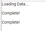
</p>As you can see, we now have 3 child components, and they’re all returning the complete message at different times:
Let’s add one last thing to the generic child html file, a simple text box. You can imagine each control might have some user interaction and we don’t want the user to be able to do anything until each instance of generic child loads its data:
Generic child HTML (generic-child.component.html)
<p>{{ displayText }}</p>
Value: <input type = "text" />
As it stands, you can enter data into each text box before the data has completed its simulated load:

So, let’s fix all this and talk about how we’re going to coordinate this in the parent component. I said earlier we’re going to use some output variables and some simple math, and I wasn’t kidding. Let’s add two class variables to the parent:
App Component (app.component.ts)
    private targetNumberOfComponentsToLoad = 3;
    private currentNumberOfComponentsLoaded = 0;
And a method that our child components will call as they finish up their simulated data loads:
  childComplete(caller: number) {

    this.currentNumberOfComponentsLoaded += caller;

    if (this.currentNumberOfComponentsLoaded ===
        this.targetNumberOfComponentsToLoad) {
      this.closeLoadingPanel();
    }

  }
Now add the output variable to the generic-child component:
Generic child component (generic-child.component.ts)
@Output() readonly childComplete: EventEmitter<number> = new EventEmitter<number>();
And then emit the event with a value of 1 when the simulated data load is complete:
      ......
      this.displayText = 'Complete!'
      this.childComplete.emit(1);
Our completed child component now looks like this:
Generic child component (generic-child.component.ts)
export class GenericChildComponent implements OnInit {

  @Input() delay = 0;
  @Output() readonly childComplete: EventEmitter<number> = new EventEmitter<number>();

  displayText = 'Loading Data....'

  ngOnInit(): void {

    setTimeout(() => {

      this.displayText = 'Complete!'
      this.childComplete.emit(1);

    }, this.delay);

  }
Now we provide the event binding in the output variable in the HTML tag of each child instance much like we did for the property binding in the input variable of ‘delay’:
App component HTML (app.component.html)
<p>
   <app-generic-child [delay]="5000"
   (childComplete)="childComplete($event)"></app-generic-child>
</p>

<p>
    <app-generic-child [delay]="2000"
   (childComplete)="childComplete($event)"></app-generic-child>
</p>

<p>
    <app-generic-child [delay]="3000"
   (childComplete)="childComplete($event)"></app-generic-child>
</p>
So each child now can fire the childComplete() method in the parent as their data load completes. But before we run this, let’s make one final change to the parent component:
App component (app.component.ts)
  ngOnInit(): void {
    this.openLoadingPanel();
  }
We’ve added a call to openLoadingPanel() right in the OnInit method because we want the Loading Data panel to display when the component is rendered. Now, as each child completes, they will call childComplete() and increment currentNumberOfComponentsLoaded by 1:
this.currentNumberOfComponentsLoaded += caller;And while any child component is waiting to render its data, we are locked out of interacting with any of the form controls, as we intended:

Once all children have finished and currentNumberOfComponentsLoaded equals targetNumberOfComponentsToLoad, closeLoadingPanel() is called:
    if (this.currentNumberOfComponentsLoaded ===
        this.targetNumberOfComponentsToLoad) {
      this.closeLoadingPanel();
    }
And voila, we have a fully populated page of components complete with a Loading Data dialog displayed until all children have finished loading.
In closing, this is a super simple method for a parent component to keep track of child data loads, but this method is great for a few other reasons:
1) Changing the number of components that load is as simple as changing the targetNumberOfComponentsToLoad variable.
Again, if you have 3, 5, 10, 20 components, all you have to do is change the target value and this method works.
2) It works with any level of component nesting
There’s no limit on how many levels of children you can use with this method. If you ever have a case where you have a parent component with children and that component has its own children – no matter the level, a component simply waits until all its child components have checked in, then reports to its parent that it’s complete. That component can then do the same to its parent.
3) It doesn’t just have to be a number; you can get fancy with what you pass back to the parent.
In this case, we’re just passing a “1” back to the parent, but we could also pass something a bit more exotic like a message. You could imagine a case where the parent might have a central area where the status of each load is being reported:
Dashboard Status:
- Employee data is loading
- Sales data is complete
- Forecast data is loading
For your reading pleasure:
Angular CDK and Overlay: https://material.angular.io/cdk/overlay/overview
Inputs and Outputs: https://angular.io/guide/inputs-outputs
Some Notes on the “strictPropertyInitialization” Setting: https://blog.angular.io/angular-cli-strict-mode-c94ba5965f63