
The code for this useful Angular Expand Collapse animation is on my GitHub:
JeffreyBane/ALF-My-Expand-Collapse-App (github.com)
I’ve been told (by people who don’t know anything) some of my articles are a bit long. (pardon me for caring) So, I’m going to endeavor to start writing shorter articles more conducive to people simply cutting and pasting the code and not learning anything. (happy now?)
If this makes you sad and you want to read a truly lengthy article, grab a blanket and spend some time with Pass Arguments by Reference Instead of by Value in Angular.
Joking aside, I do get it, I can be a bit wordy. (If being wordy is wrong, I don’t want to be right!)
ANYWAY, let’s look at a pretty useful animation, one that dynamically expands and collapses sections of data, that’s also easy to understand. So, this will be ideal if you’ve never worked with Angular animations before.
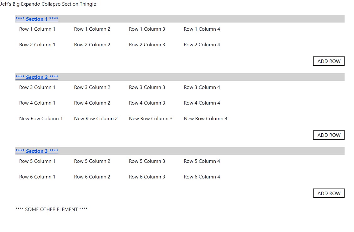
The goal is to build a grid of sorts that has section headers and detail rows. The headers are clickable so you can expand and collapse each section individually. You can also add rows to each section and the animation will be able to handle the ever-changing height of each section no problem. There’s no requirement other than bootstrap being installed. Grab the code from my git and follow along. (quickly)
Here’s a screenshot of the expand / collapse in all its glory:
While you’re expanding and collapsing your face off, lets summarize what’s going on here. The HTML is essentially an ngFor that loops through our JSON object of sections and section rows. The add row button simply adds another item to that object.
The sexy part comes about in the div where we’re displaying the section rows:
<div id="section{{i}}" class="mb-4" [@heightGrow]="expandCollapse[i]">As we’ve defined the index in our ngFor as i, this will handle as many sections as we wish. The animation magic occurs in that tag in what’s called an animation trigger. (normally I’d write 27 paragraphs about what that is, but I’m being brief)
That trigger, @heightGrow is then bound to a property in our class, in this case an array called expandCollpse. This will have an entry for each section that will have a value of either “open” or “closed”. You could easily use a bool but “open” and “closed” make this example a bit easier to follow.
Now let’s look at our animation and (swifty, rapidly, briskly, with haste) break down what’s going on there:
export const heightGrow = trigger('heightGrow', [

    state(
        'closed',
        style({
          opacity: 0,
          height: 0,
          display: 'none'
        })

    ),
    state(
      'open',
        style({
          opacity: 1,
          height: '*',
          display: 'block'
        })
        ),
    transition('* => *', animate(300))
]);
First, the trigger is set to a constant with the same name. This allows us to organize our code a bit better – we could eventually have a constants file with all our animations then import them where needed in our components. Normally the animation code would go in the animations array in the component decorator, but since we’re using a const, we can just specify that:
@Component({
  selector: 'app-root',
  templateUrl: './app.component.html',
  styleUrls: ['./app.component.scss'],
  animations: [heightGrow]
})
Our animation has 2 states ‘open and ‘closed’ each associated with a style. In this case, closed will set the opacity to 0, height 0 and display to none. ‘Open’ will do the opposite and make our animation visible. Adding opacity gives the animation a nice fade in / fade out effect and height having a value of ‘*’ indicates auto height, so the animation will always expand to the correct size of the div.
The final item is the transition which tells it which states will trigger the animation. You can really fine tune this if you have many states (wish I could get into that more…) but in this case the wildcard indicates – animate this when any state goes to any other state (open to closed, closed to open, etc.). The 300 is how many milliseconds the transition will take.
Now that everything is wired up all we need to do is change that property when a section header is clicked on, and the animation will fire:
  handleClick(i: number) {
    this.expandCollapse[i] = (this.expandCollapse[i] === 'open') ? 'closed' : 'open';
  }
And Volia! Hopefully this gives you a bit of comfort with Angular animations as well as providing you with a handy expand / collapse animation you can use for yourself.
And I’ll stop talking now. Really this could have been 3x as long. But I’m fine. I can be brief.
There I was brief just then.
And there as well.
So I guess I’ll stop now.
Bye.
Nice, I’ll be using this one in a few apps.